Renovation of a 1960's Melbourne Home
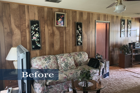
Built in 1967, this Melbourne Florida single family home was a superb example of that era's trends. Lovingly lived in and cared for, little in the house had changed over the years. When it came time to sell, the early 70's design elements were contrary to today's modern aesthetic. Although dated, the home had "good bones" that included concrete block construction, 4 bedrooms and 2 full baths. Ellingson Properties proposed that the seller renovated the residence before putting it on the market. This strategy was likely to result in a quick sale and net the seller a greater return. The seller agreed with the renovation strategy and had the resources to execute.
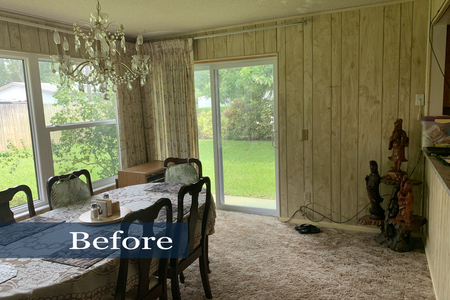
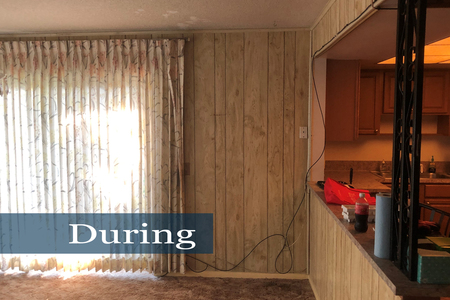
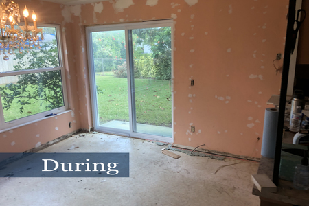
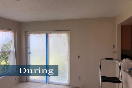
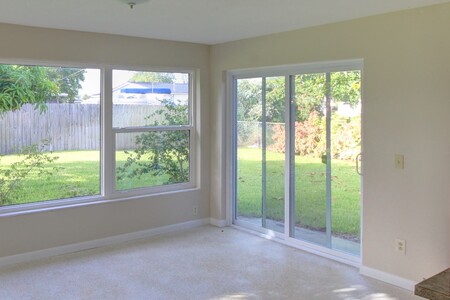
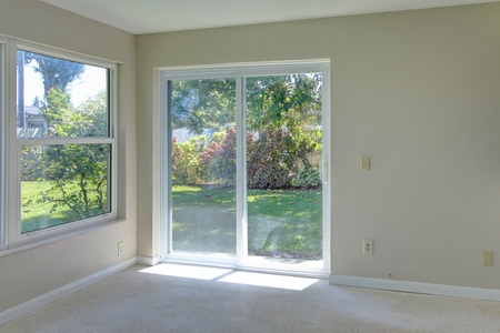
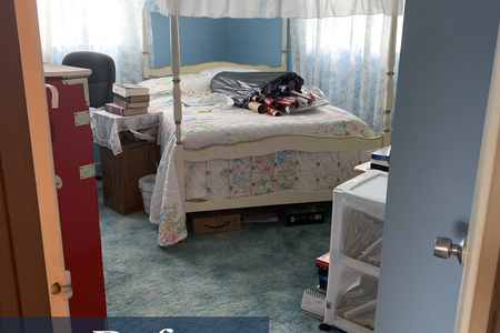
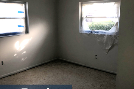
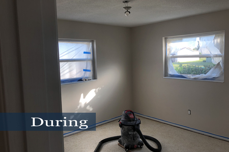
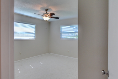
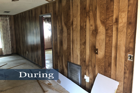
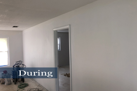
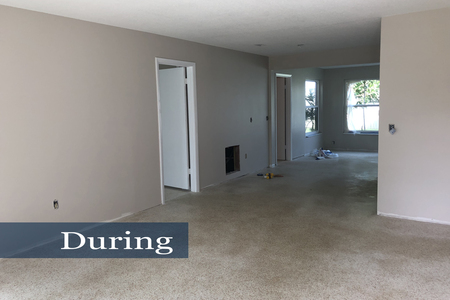
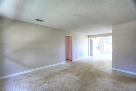
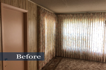
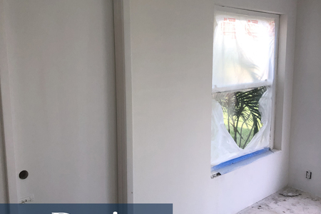
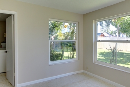
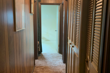
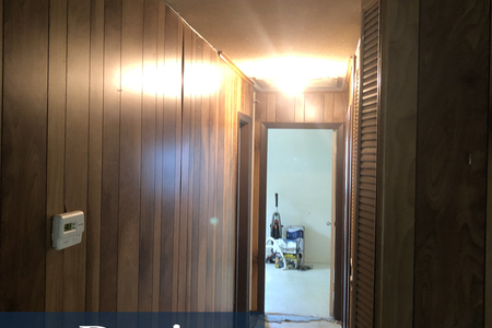
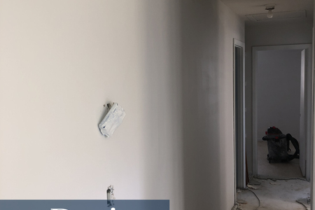
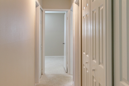
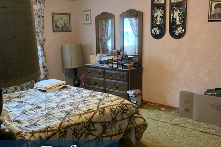
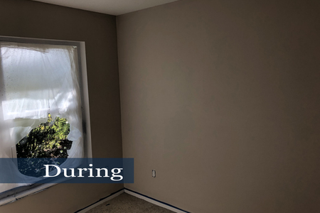
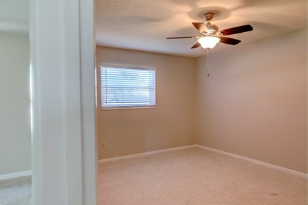
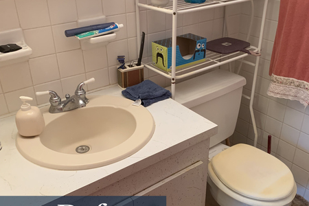
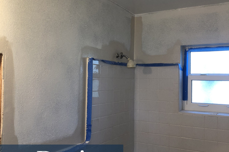
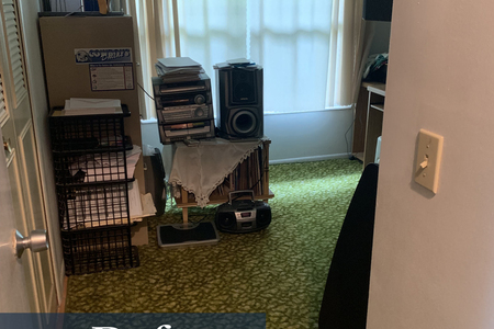
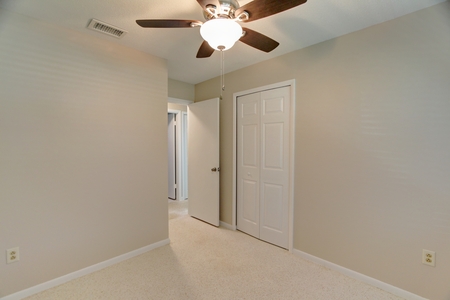
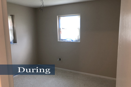
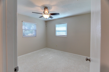
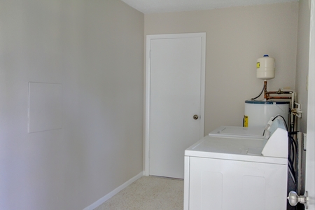
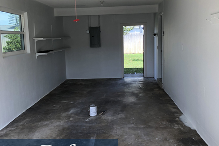
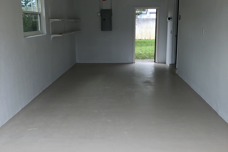
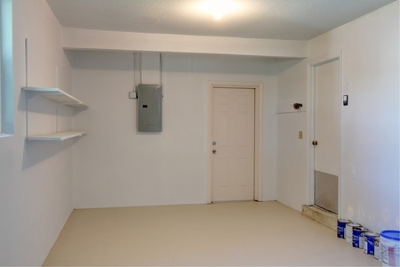
The first step was to remove the contents of the home. Furniture and chotskies were sold, donated or disposed. Next, the dated flooring (e.g. high/low pile and indoor/outdoor carpet) was removed to reveal lovely Terrazzo floors. Terrazzo flooring is not only desirable, but probably the most expensive flooring to install! The flooring was in good shape and a neutral, hence it became the cornerstone of the renovation. Wall coverings were different story. Most of the living spaces were clad in the plywood-sized sheets of wood paneling popular in the 60's and 70's. Unlike the home's flooring, the paneling has not and will likely never make a come-back. Rather than simply painting the paneling white, it was removed. Previously paneled walls required extensive prep work to fill nail holes prior to texture and paint. Wallpaper in the bathrooms and bedrooms was also removed then the walls textured and painted. All walls were painted in Sherwin-Williams' Accessible Beige and all trim and doors were painted Alabaster. Bathrooms were outfitted with new vanities and toilets. Rather than repaint, the worn out louvered bi-fold doors were replaced with contemporary paneled bi-folds.
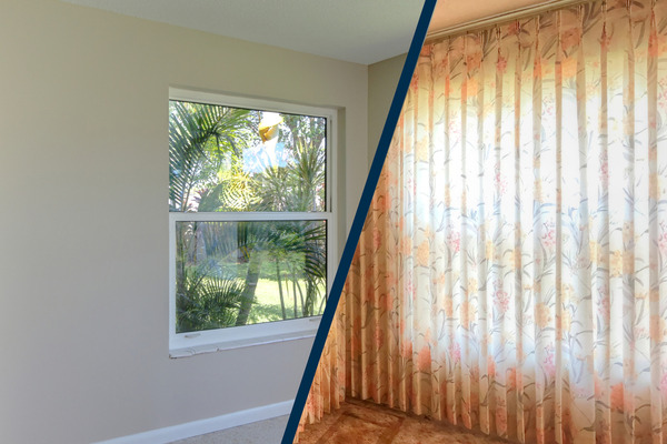
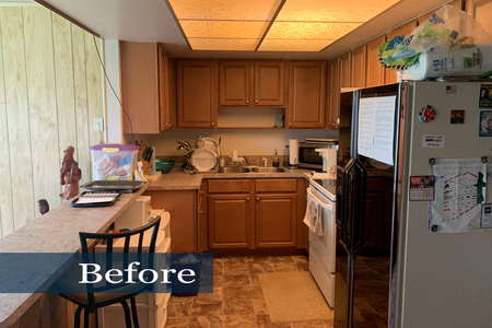
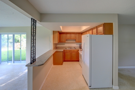
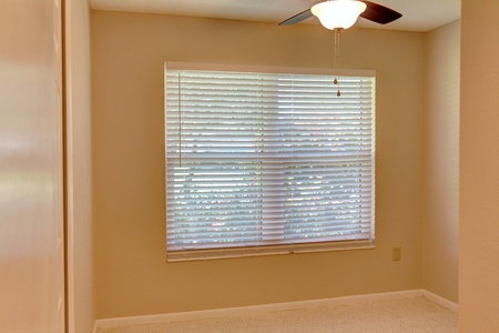
A significant portion of renovation budget is usually earmarked for the kitchen. This home however, required little expense to renovate. Besides flooring, the kitchen was transformed by removal of drop ceiling florescent lighting. The resulting recessed ceiling illumination alluded to a more spacious space. Likewise removal of the heavy 60's window treatments, especially those that stretched from floor to ceiling, and replacement with mini blinds contributed to a room's airy feel.

